Theme Developer's Guide: Defining Content Areas
One of Wheelhouse's key strengths is its ability to define unlimited custom content areas within your templates which are processed automatically to generate easy-to-use admin forms for content entry.
Wheelhouse currently supports four content types: HTML content, single-line text, images and loops.
HTML content
The content method adds a HTML content area to your template, which appears as a WYSIWYG editor within the page editing form when the template is selected. The method accepts an optional field label as well as an options hash. If no label is specified, the label Page Content will be used.
Example:
<%= @page.content "Introduction", :rows => 5, :note => "Keep it short." %>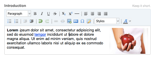
Options:
- :rows — the number of rows for the HTML editing area (approximate due to styling)
- :editor — pass
:simpleto use the simplified editing toolbar - :css — specifies a custom stylesheet for the editing area (by default
admin.cssis used from the current theme if it exists) - :note — adds a descriptive note above the editing field for the admin user
Single-line text
The text method adds plain, unformatted text to your template with a corresponding single-line text field within the page editing form. A field label is required as the first argument, unless used within a loop (see below) in which case the field label is optional.
Example:
<%= @page.text "Section Title", :note => "Customize this section's title." %>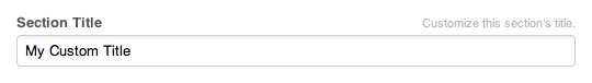
Options:
- :style — controls the flow of admin fields and their labels (use
:inlineto show the label and field on the same line and:fixedto line up multiple labels) - :default — the default value to assign if no other value is provided by the editor
- :placeholder — placeholder text for the text field
- :note — adds a descriptive note above the editing field for the admin user
Images
As you might expect, the image method adds an image to your template, along with an image selector widget in the page editing form. As with single-line text, a field label is required as the first argument unless used within a loop.
When a width or height is provided, the image will be resized automatically to the requested size. Cropping may occur if both the width and height are given and the chosen image has a different aspect ratio. The URL of the resized image can be accessed via the url method on the returned image object.
If an image is not selected within the admin form, no content is rendered.
Example:
<%= @page.image "Header Image", :width => 800, :height => 250 %>
<%= @page.image("Header Image").url %>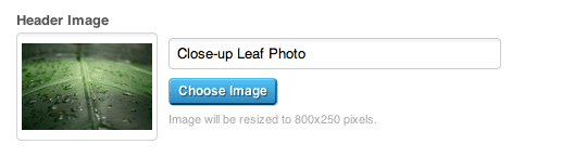
Output:
<img alt="Close-up Leaf Photo" height="250" src="/media/BAhbCFsHOgZmSSIWMzEzZ.../Leaf.jpg?sha=be1da7ce" width="800" />

/media/BAhbCFsHOgZmSSIWMzEzZ.../Leaf.jpg?sha=be1da7ce
Options:
- :width — the width of the image
- :height — the height of the image
Loops
Repeating fields or groups of fields can be added using the loop method. The method takes a loop name (required) and yields a loop object, upon which the content, text and image methods described above can be called. If a second block parameter is given, the loop index (counting from 0) is also yielded.
Loops can be used for a wide variety of situations. Used with content fields, multi-columned pages can be easily created. When combined with image fields, loops allow you to create ad-hoc galleries and slideshows without the need for a more complex gallery plugin. Looped fields open up a huge range of possiblities to your templates, without creating a maintenance nightmare for the site administrator.
Example:
<% @page.loop("Contributors") do |contributor| %>
  <div class="contributor">
    <%= contributor.image :width => 100 %>
    <%= contributor.content :rows => 3, :editor => :simple %>
  </div>
<% end %>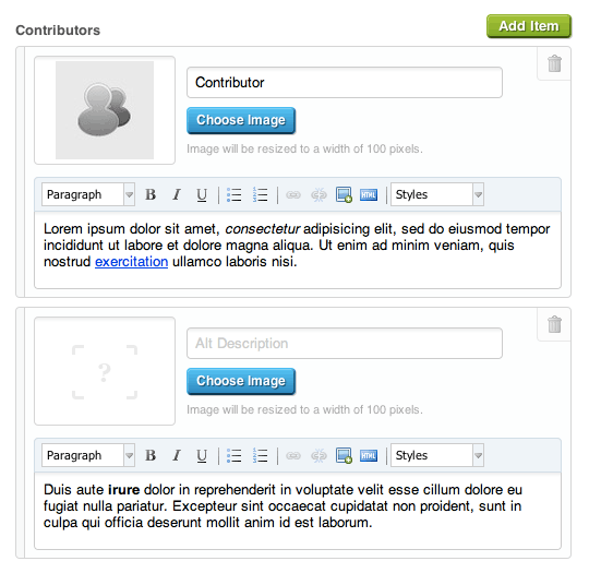
Output:
<div class="contributor">
  <img src="/media/BAhbB1sHOgZmIiA5MDBkYz.../Contributor.jpeg?sha=46f5e5e3" alt="Contributor" width="100" />
  <p>Lorem ipsum...</p>
</div>
<div class="contributor">
  <p>Duis aute...</p>
</div>
Options:
- :add — the label for the add button (default is
"Add Item") - :include_blank — set to true to yield blank content and images to the loop (default is
false)